Page structure
The layout used by the Framework is a wrapper that helps structure your page.
This structure is informed by a large amount of UX research, team feedback, and tweaked to be compliant with the EMBL and EMBL-EBI branding.
In short: using the boilerplate formats will help save you time, deliver a better experience to the users and keep the branding watchdogs happier.
What is the structure?
We have divided the page areas into three types:
- Centrally governed: here content and structure are managed by EMBL-EBI (global masthead and global footer);
- Structured with custom content: the content is managed by a service, but structure is managed by EMBL-EBI (i.e. local masthead and local footer); and
- Custom: content and structure are governed by the service with guidance from within this pattern library.

See also: Sample pages
What are the regions of the site?
Global masthead (aka: global menu)
The global navigation menu sits at the top of every page. It is designed to be easy to find yet unobtrusive, so as not to confuse users who wish to use the navigation menu for your site.
Local masthead (aka: local menu)
The local menu is the navigation menu for your website and it sits below the main banner. It is optional, since not all projects require their own menu. Since it is a horizontal menu, you need to think about the text length of labels. We recommend that your first menu link is "Home" and your last one is "About [project-name]".
Breadcrumb trail
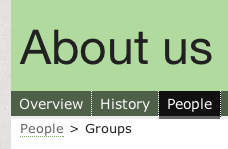
A breadcrumb can help users understand the structure of sites with a large degree of hierarchy, but you should first rely on the global header, local title, and local menu to indicate structure, using a breadcrumb only when that fails. For guidance on your information architecture, contact the web development team.
 [UPDATE IMAGE…]
Content area
The #content area is where your core information and application will live, this area should contain content and any secondary navigation.
Main content area
The #main-content-area holds the core content of your page. This ID will also be used to improve the behaviour of the sticky menu and improve JS Event tracking.
Secondary menus
Once the user has selected an item from your local menu, the section may require a secondary navigation menu to display its own child content. Depending on the breadth and depth of content options, there are two possibilites:
Secondary strip navigation
If your page has a few child pages, use this pattern of tabs. It occupies both a highly visible and conceptually similar spot to the local menu.
We recommend using this for no more than eight child pages/links.
Use a ul element with classes .menu.secondary-menu; see a full example on the EMBL-EBI main site
Secondary book navigation
If your page has many child pages and some of those pages have their own child structure, we recommend using this index-like navigation pattern as it will allow you to show dozens of pages of varying depth and allow the reader to track their progress and location.
Use a ul element with classes .menu.vertical; see a full example to the right or on the EMBL-EBI main site
Relationships
Use the (#relationships) area to place information and logos from your sponsors/affiliates/collaborators/endorsers. For more guidance see the affiliates boilerplate page.
Local footer
Use the local footer (#local-footer) to describe information that applies to your whole website or to indicate citation information.
Global footer
In the global footer of every page there is an expanded version of the global menu, including all sub-items. This acts as a top-level sitemap, available on any page. This will be automatically populated with Javascript into your #global-footer.

Have a use case that's not covered?
Please open an issue in the tracker. We'll update this living pattern library with your feedback.

